BENEFIT-FIRST UI/UX SHIFT
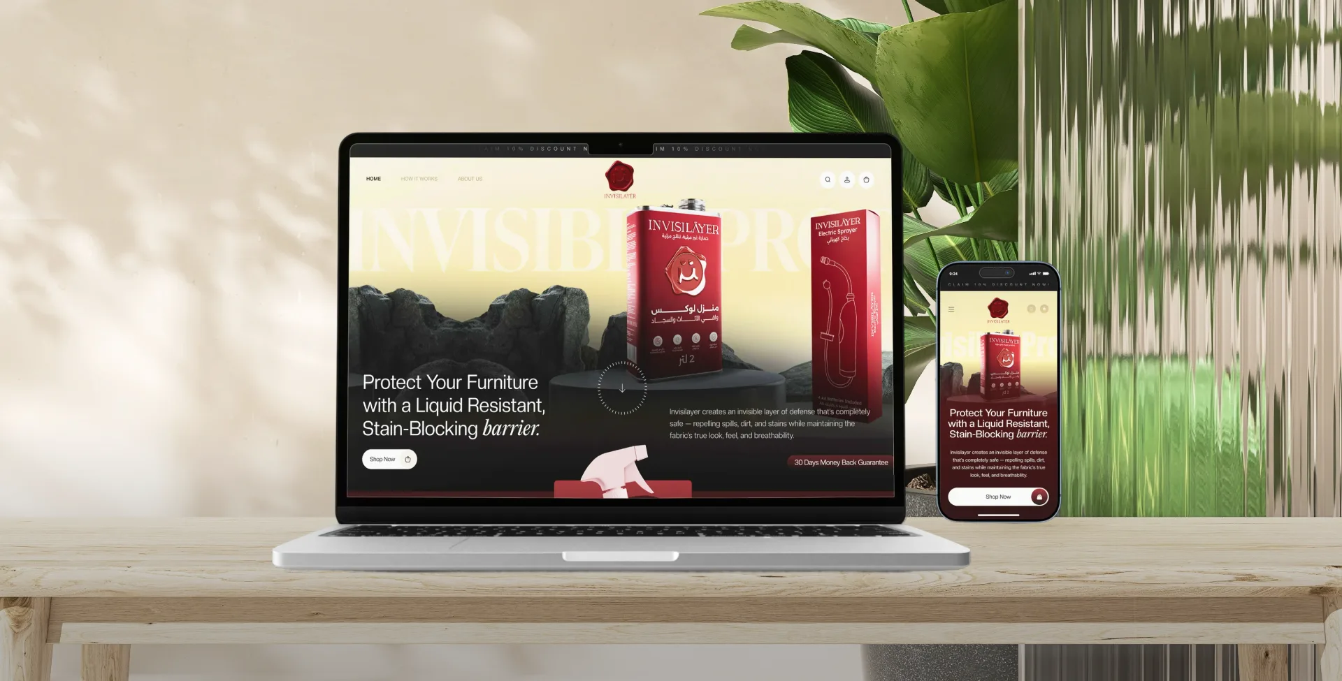
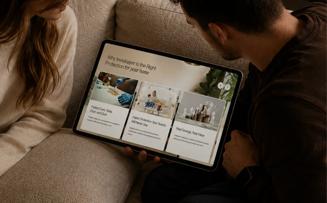
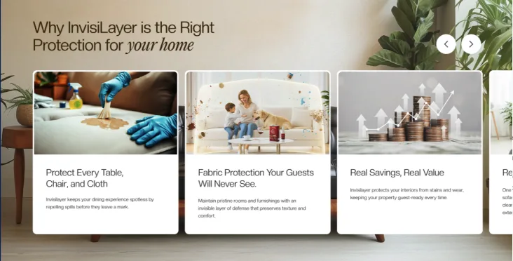
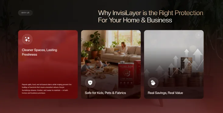
Transitioned to a bright, modern visual aesthetic featuring bold benefit cards that communicate core value propositions instantly on arrival.

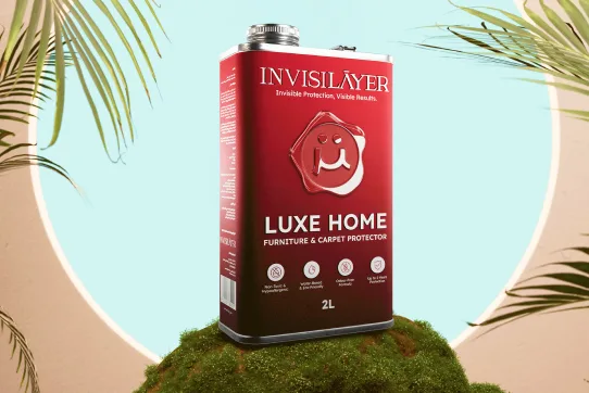
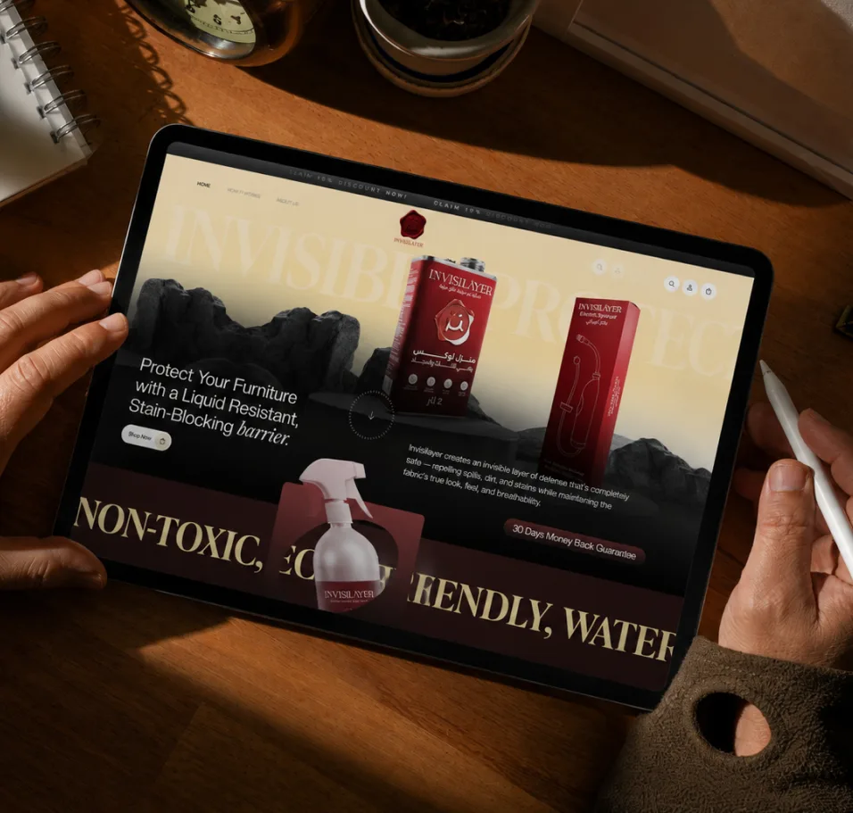
Powered by precision German engineering, this invisible barrier repels liquids and blocks deep-seated stains before they form.
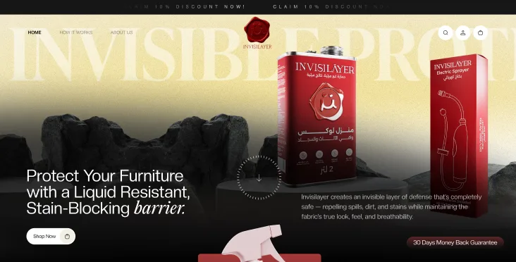
INVISILAYER offers a revolutionary line of next-generation nano-coating products designed to protect furniture, carpets, and fabrics from spills, stains, and bacteria.
Bringing nano-coating protection through sleek visual identity and seamless design.

We boosted user understanding, elevated brand credibility, increased
conversions, and significantly decreased customer support inquiries.

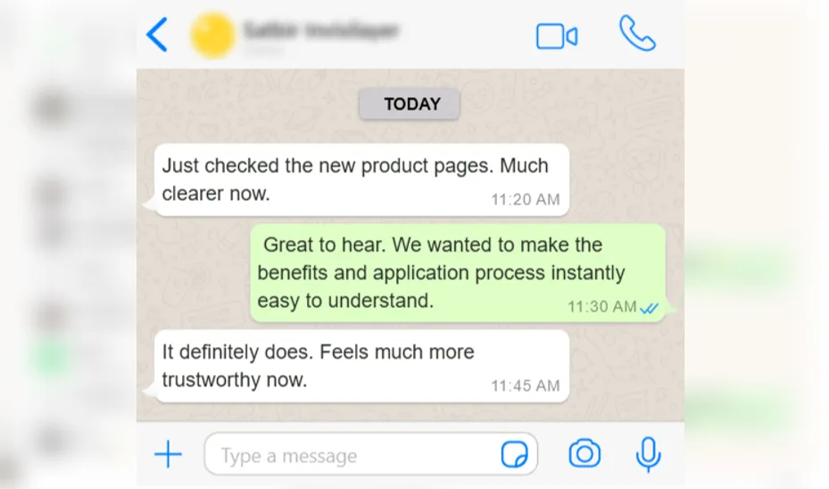
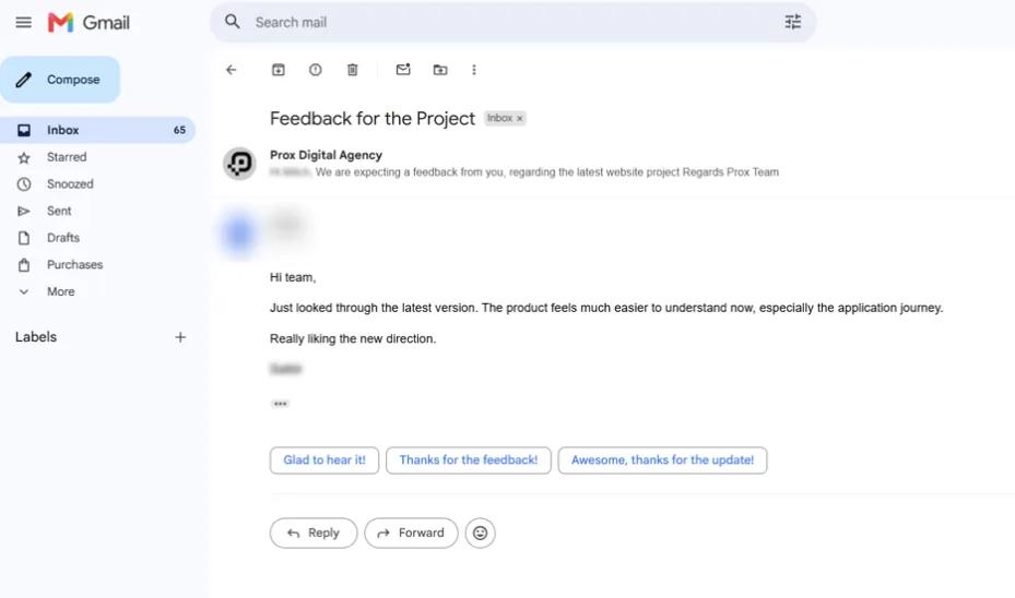
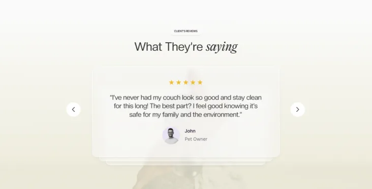
Hear how our redesigned platform built consumer trust and translated complex material science into clear, daily utility for InvisiLayer.

By prioritising clarity and moving the focus from 'what the product is' to 'how the product helps you,' the new UI/UX design successfully solved the challenge of visualising the invisible. The result is a platform built on confidence.


"INVISILAYER faced an aesthetic disconnect with its dark palette, lack of clarity regarding application steps, and user skepticism around nanotechnology product safety and effectiveness."
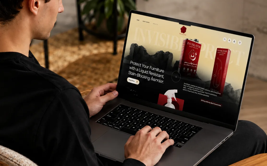

Clear visual storytelling that builds
consumer trust and accelerates sales.
Transitioned to a bright, modern visual aesthetic featuring bold benefit cards that communicate core value propositions instantly on arrival.
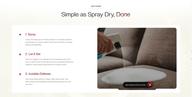
Developed an intuitive guide titled "Simple as Spray, Dry, Done" to demystify application procedures and build customer confidence.
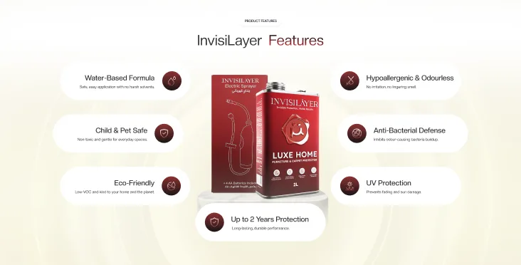
Showcased key product features with clear visual badges emphasizing child-safe, pet-safe, water-based, and antibacterial properties directly.
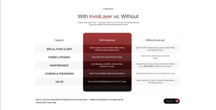
Integrated third-party data insights alongside real-time purchasing social proof to validate consumer needs and accelerate conversion decisions.


Explore a collaborative deep dive with our experts and discover
how we would accelerate your path to digital success.

![[In Their Own Words]](https://prox-uk-wp.proxdigitalagency.co.uk/wp-content/uploads/in-there-own-word.svg)
As a global agency built for growth-hungry leading brands, every project below is proof, a problem solved, a business transformed, another brand that stopped waiting and started winning through sharper thinking, faster execution, and creative ideas.

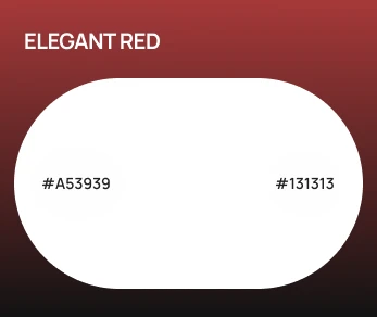
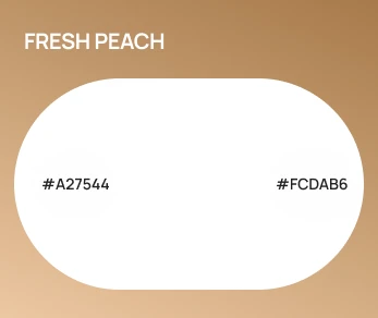
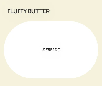
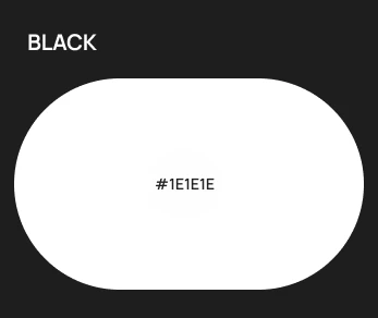
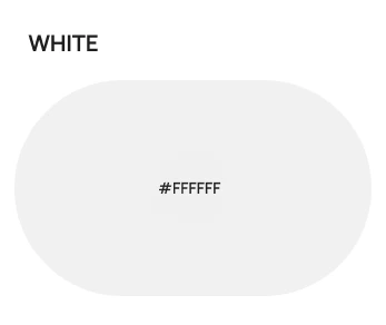
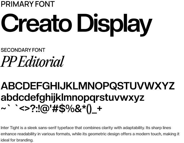
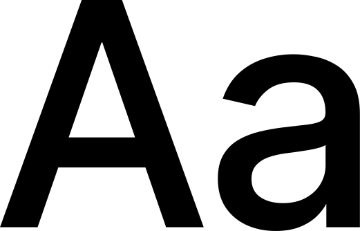
Inter Tight is a sleek sans-serif typeface that combines clarity with adaptability. Its sharp lines enhance readability in various formats, while its geometric design offers a modern touch, making it ideal for branding.

As a creative and digital agency UK, always making certain that every project below represents a challenge solved, a business transformed, and another global brand moving ahead of the market through fearless ideas, sharper thinking and intelligent systems.
As a creative and digital agency UK, always making certain that every project below represents a challenge solved, a business transformed, and another global brand moving ahead of the market through fearless ideas, sharper thinking and intelligent systems.
If you’re looking for a global growth agency that understands growth, execution, and accountability, you’re in the right place.