LUXURY ICON BRANDING & VISUAL SYSTEM
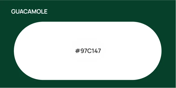
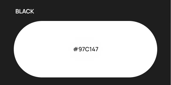
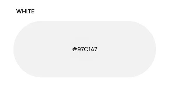
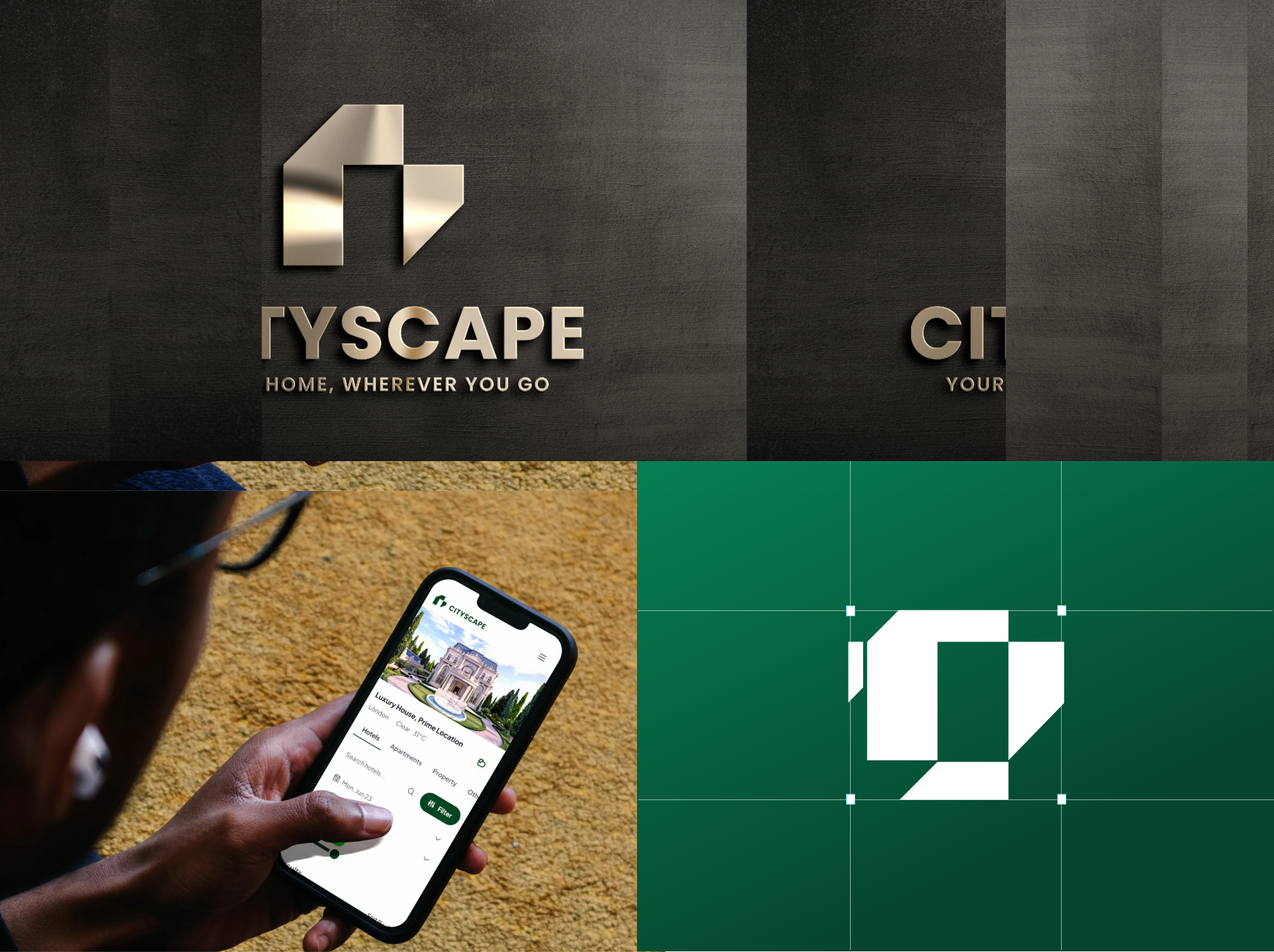
Created a minimalist icon-only mark paired with a deep green palette, evoking traditional London sophistication and institutional reliability across all digital product interfaces.
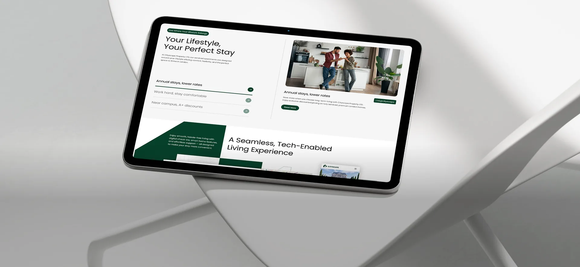

We partnered with Cityscape Property LTD to deliver a complete digital evolution, uniting high performance web development with a focused search and brand strategy.
Cityscape Property LTD is a London based PropTech and serviced accommodation provider moving beyond basic property listings to deliver hotel-standard hospitality management for guests and landlords.
Created a high converting platform positioning Cityscape Property LTD as an industry authority.
Cityscape Property LTD is a London-based PropTech and serviced accommodation provider delivering hotel-standard hospitality management for guests and landlords.
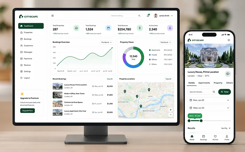
Live availability synced across every user in real time. Reduced double-bookings to zero.
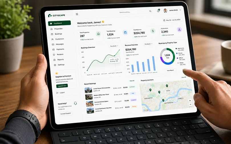
Secure checkout built directly into the booking flow. Cut drop-off at payment by 40%.
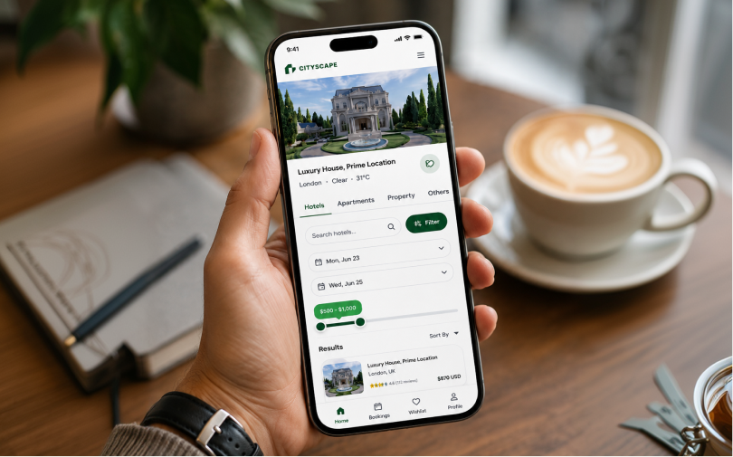
Automated reminders and status updates sent at the right moment. Reduced no-shows by 25%.

The technology behind Cityscape Property,
chosen for speed, security, and growth.











We accelerated internal asset velocity, elevated brand premium positioning,
streamlined guest booking flows, and improved overall operational efficiency.


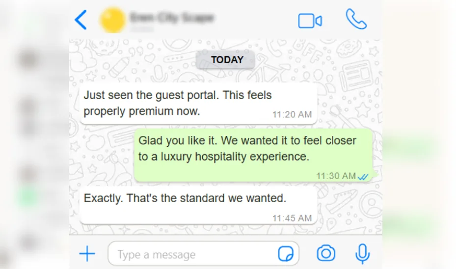
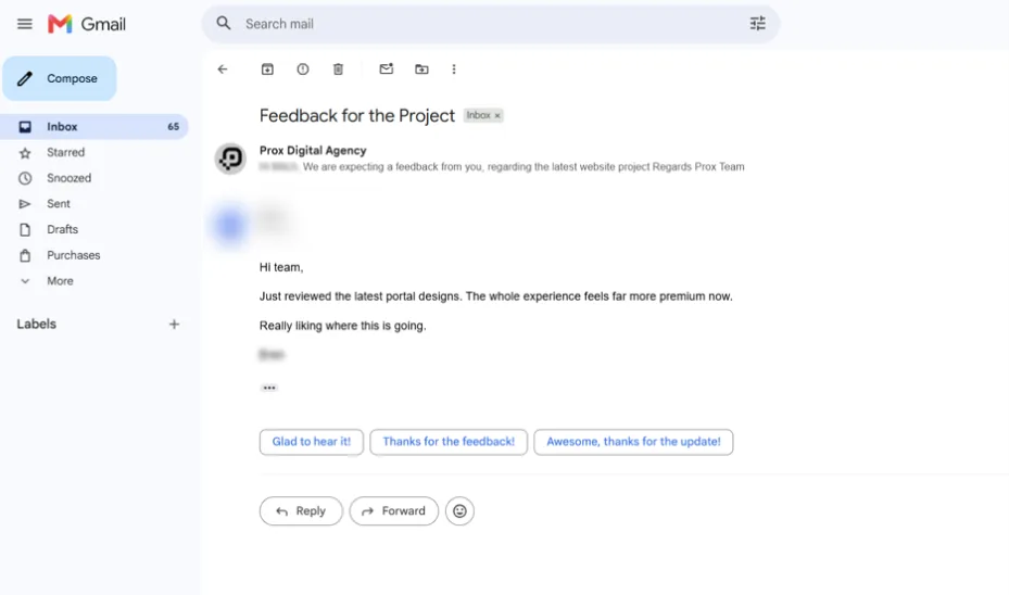
Here is how our redesigned platform streamlined complex financial operations, directly from the Leadership Team at Cityscape Property LTD.

The visual simplicity of the new platform is deceivingly powerful. It took the friction out of a fundamentally complex process. Transitioning from traditional property management to a tech-enabled hospitality platform required an absolute commitment to trust and design excellence. The team built a digital product that uplifts our brand, optimises internal operations, and delivers a 5-star experience to our guests.



Explore a collaborative deep dive with our experts and discover how we would accelerate your path to digital success.
Book a Free Strategy Call

While Cityscape Property LTD offered a powerful suite of accommodation services, the legacy digital presence struggled to keep pace with rapid expansion, creating brand positioning gaps against London competitors, booking friction, and operational bottlenecks across property management.

See how we stripped away complexity to build a clean, high performance PropTech framework that saves valuable time weekly.
Created a minimalist icon-only mark paired with a deep green palette, evoking traditional London sophistication and institutional reliability across all digital product interfaces.
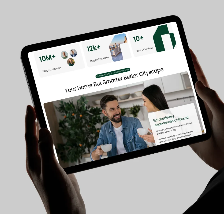
Designed a high-density operational platform for internal staff featuring automated pricing controls, occupancy heatmaps, maintenance scheduling, and landlord payout reporting.
Designed a customer portal focused on high-resolution property storytelling, clear amenity displays, and a streamlined booking flow optimised for rapid checkout.
Engineered a dedicated interface for property owners to monitor real-time revenue performance, occupancy rates, and asset management status with total transparency.
![[In Their Own Words]](https://prox-uk-wp.proxdigitalagency.co.uk/wp-content/uploads/in-there-own-word.svg)
As a global agency built for growth-hungry leading brands, every project below is proof, a problem solved, a business transformed, another brand that stopped waiting and started winning through sharper thinking, faster execution, and creative ideas.

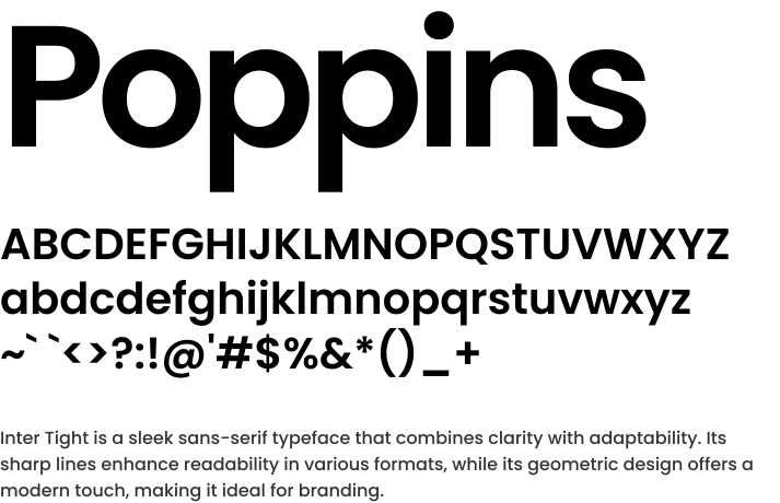
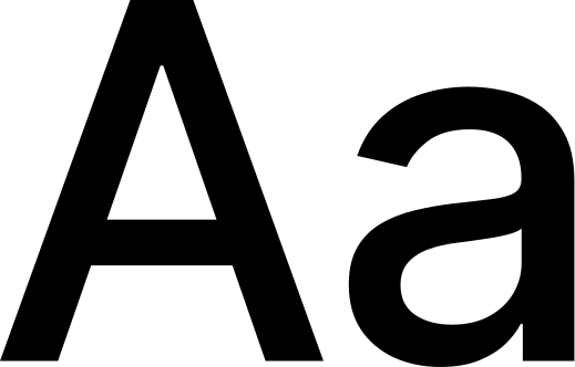
Inter Tight is a sleek sans-serif typeface that combines clarity with adaptability. Its sharp lines enhance readability in various formats, while its geometric design offers a modern touch, making it ideal for branding.

As a creative and digital agency UK, always making certain that every project below represents a challenge solved, a business transformed, and another global brand moving ahead of the market through fearless ideas, sharper thinking and intelligent systems.
As a creative and digital agency UK, always making certain that every project below represents a challenge solved, a business transformed, and another global brand moving ahead of the market through fearless ideas, sharper thinking and intelligent systems.
If you’re looking for a global growth agency that understands growth, execution, and accountability, you’re in the right place.